Apparition Single-Page App Theme


Posted by James Futhey on Saturday, August 02, 2014

Apparition is a Single-Page App theme for ghost, adding categories, subcategories, syntax highlighting, & a beautiful, touch-friendly interface. Instead of generating static pages, Ghost is transformed into a Single-Page App. Visitors are able to navigate posts through touch, or with the keyboard or mouse. A menu is automatically generated with

Apparition is a Single-Page App theme for ghost, adding categories, subcategories, syntax highlighting, & a beautiful, touch-friendly interface.

Instead of generating static pages, Ghost is transformed into a Single-Page App. Visitors are able to navigate posts through touch, or with the keyboard or mouse.

A menu is automatically generated with categories and subcategories, allowing for your visitors to quickly find posts in a very large blog.

Finally, a fallback is automatically created for SEO optimization & for mobile visitors.

Using the Apparition Theme

The Apparition theme automatically adds many new features to Ghost, including:

  1. Touch / Swipe Navigation
  2. Keyboard Navigation
  3. Menu Navigation
  4. Categories / Subcategories
  5. A Single-page application interface (No page reloads!)
  6. Lightbox for images
  7. Syntax highlighting for code blocks
  8. Disqus Commenting
  9. Social Profiles

In the Ghost App, posts are displayed in a fullscreen slider when the page loads.

Try swiping left / right, pressing left / right on the keyboard, or using the left / right arrows to navigate between posts.

Swiping down, pressing the down key, or clicking the down arrow will take you to the full post.

iOS / Mobile fallback, SEO Friendly pages

An alternate, static set of pages are generated for the index and for each post to facilitate mobile and iOS viewing. This also acts as a set of SEO friendly pages which can be crawled by google & other web robots.

This will appear automatically & doesn't require any additional setup.

Installation

Unzip this theme to ./ghost/content/themes/ & select it from the General Settings page.

While you're there, set Posts per page to 1000.

Your Blog Title is what will appear as your site logo in the upper-left hand corner of the app.

You can upload a default Blog Cover, which will be displayed for any post without a cover defined.

category: Help
subcategory: Readme
subtitle: The single-page app theme for ghost
cover: https://37.media.tumblr.com/bddaeb8fe12eda6bb40cf6a0a18d9efa/tumblrn8zm8ndGiY1st5lhmo11280.jpg

The information in your User Settings will be displayed at the bottom of each post (except for the cover).

You will also need to edit the line of your ./ghost/config.js file which contains your blog URL. (See Ghost documentation)

Writing a Post

All current Ghost features are supported, along with a few additions.

Posts are written using markdown. (See Ghost documentation)

Cover Image

You can set an optional cover image by including the following snippet at the bottom of your page:

cover: https://url-to-your-image.jpg

Ensuring that you replace https://url-to-your-image.jpg with the URL to the image you wish to use.

Categories & Subcategories

You can optionally place your blog posts inside categories and subcategories by including the following snippet at the bottom of your page:

category: Blogging
subcategory: Ghost

Ensuring that you replace Blogging and Ghost with your respective category and subcategory. These are case sensitive, and will be used
to automatically generate a dropdown menu for your blog, which will display links to only posts in specific subcategories.

Subtitle

A subtitle is an optional secondary title for your blog post, displayed below the headline title.

You can optionally add a subtitle to your posts by including the following snippet at the bottom of your page:

subtitle: This is my blog subtitle

Ensuring that you replace This is my blog subtitle with your desired post subtitle.

Enabling Disqus Comments

To enable comments on your blog, sign up for an account at disqus.com. You will be given a Disqus Shortname for your blog.

Enter this shortname inside your Blog Description on the General Settings page. Make sure it is on a line all by itself, preceeded by shortname:

For example, my shortname is kidgodzilla, so my blog description looks like this:

Just a blogging platform.
shortname: kidgodzilla

You can enable any number of social media links to be displayed below each post by including the following snippet in your Author Bio:

Thanks for reading this post! Follow our blog for instant updates.
facebook: kidgodzilla
twitter: @dgamr
gplus: +dGamr
pinterest: dgamr
github: kidgodzilla

Ensuring that you replace my usernames above with your account usernames. If you do not wish to display a social media link for a
particular service, ensure you do not include the line for that service. Links will appear automatically at the bottom of each post.

Copyright & License

Copyright © 2014 James Futhey. All Rights Reserved.

THE SOFTWARE IS PROVIDED "AS IS", WITHOUT WARRANTY OF ANY KIND, EXPRESS OR IMPLIED, INCLUDING BUT NOT LIMITED TO THE WARRANTIES OF MERCHANTABILITY, FITNESS FOR A PARTICULAR PURPOSE AND
NONINFRINGEMENT. IN NO EVENT SHALL THE AUTHORS OR COPYRIGHT HOLDERS BE LIABLE FOR ANY CLAIM, DAMAGES OR OTHER LIABILITY, WHETHER IN AN ACTION OF CONTRACT, TORT OR OTHERWISE, ARISING FROM, OUT OF OR IN CONNECTION WITH THE SOFTWARE OR THE USE OR OTHER DEALINGS IN THE SOFTWARE.

//www.gravatar.com/avatar/9217f68fb557d906a5b7c625bc8bf7dd?d=404
Web Developer
kidgodzilla.com

Thanks for reading this post! Follow our blog for instant updates. facebook: dgamr twitter: dgamr gplus: 112387059563392387400 pinterest: dgamr github: KidGodzilla

Tagged: help, quickstart, getting started, readme, installation

LESS Variables, Mixins, & Nesting


Posted by James Futhey on Thursday, July 24, 2014

LESS Variables Less variables allow us to avoid writing duplicate code, and to make "global" changes quick & effortless. The most common use of LESS variables is for color theming. Imagine your typical HTML5 webpage. Usually, you'll reuse a palette of 3-5 colors in a design, maybe with a few

LESS Variables

Less variables allow us to avoid writing duplicate code, and to make "global" changes quick & effortless. The most common use of LESS variables is for color theming.

Imagine your typical HTML5 webpage. Usually, you'll reuse a palette of 3-5 colors in a design, maybe with a few tints and shades of those base colors. But what happens if, for example, you want to change your maincolor? You could search and replace all occurences of that color, and then recalculate your tints and shades & varients of that color. Alternatively, using LESS, you could change them on the fly using variables.

Typically, variables are located at the beginning of the document (so that future changes are quick and easy), but this is not a restriction of the LESS syntax. The syntax for creating a LESS variable is as follows:

@variable-name: #fff;

Now, for example, you could replace all occurences of #fff in your code with @variable-name, and when you changed the variable at the top of your document, the changes would occur in multiple places.

@variable-name: #fff;
body {
  background-color: @variable-name;
}
a:hover {
  color: @variable-name;
}

LESS Mixins

Mixins are sets of properties which can be "mixed in" to other blocks of CSS (based on the DRY principal; Don't Repeat Yourself). If you've worked with classes and inheritance in other languages this will seem familiar.

In LESS, all we need to do to include one class (using the dot syntax) in another block of CSS is to reference it.

For Example:

.global-padding {
  padding: 10px;
}
#my-div {
  .global-padding;
}
.footer-div {
  .global-padding;
}

In this example, we created a css class 'global-padding'. Then, we included it's as a default inside of two other DOM elements using straightforward syntax.

Note: It does not matter if the DOM element exists or not, but beware that if the class was referenced in the DOM you would be making changes to the DOM itself.

LESS Nesting

Another timesaving feature of LESS that will help you write less code is nesting. In the following example, you'll see that we repeat #header several times:

#header {
  color: black;
}
#header .navigation {
  font-size: 12px;
}
#header .logo {
  width: 300px;
}

One way we could refactor this code is through nesting. LESS by default assumes all nested elements are child elements. See the example below:

#header {
color: black;
.navigation {
   font-size: 12px;
}
.logo {
   width: 300px;
}
}

This LESS would compile to the same CSS, but the LESS file is much easier to work with.

That's 90% of what you need to know to make your lives more productive and make your CSS more efficient with LESS! Enjoy!

cover: https://38.media.tumblr.com/76796874419b8de16c3297a013c16dd6/tumblrn9hy0iH7in1st5lhmo11280.jpg
subtitle:A Brief Introduction to LESS, Part II
category:CSS
subcategory:LESS

//www.gravatar.com/avatar/9217f68fb557d906a5b7c625bc8bf7dd?d=404
Web Developer
kidgodzilla.com

Thanks for reading this post! Follow our blog for instant updates. facebook: dgamr twitter: dgamr gplus: 112387059563392387400 pinterest: dgamr github: KidGodzilla

Tagged: Variables, Nesting, Mixins, Less, CSS

GPU Accelerating your CSS Animations


Posted by James Futhey on Thursday, July 24, 2014

Why do we need GPU acceleration? Many CSS animations, especially those that affect margin sizes, require massive amounts of the screen to be repainted for each and every frame that is generated. Worse, moving larger items or adjusting margins through CSS animations sometimes requires offscreen data to be recalculated as

Why do we need GPU acceleration?

Many CSS animations, especially those that affect margin sizes, require massive amounts of the screen to be repainted for each and every frame that is generated. Worse, moving larger items or adjusting margins through CSS animations sometimes requires offscreen data to be recalculated as well. This can become overwhelming for our general purpose CPU thread, which is already doing the heavy lifting of rendering one or more pages, and running increasingly extensive amounts of JavaScript. And for technical reasons I won't get into, a general-purpose computing device such as the CPU is not well-suited for this task to begin with.

The Solution? GPU Acceleration

Increasingly, more and more PCs and Mobile devices, even on the low-end, are being shipped with powerful GPUs accessible by most modern browsers (including IE 10+!). These are the same chips capable of rendering complex animation for 2d and 3d gaming, and typically, when you're browsing the internet, they go completely unused. The browser, by default, does not make use of this hardware for most animations. Worse, even with only a few objects being animated, your CSS animations can bring your webpage to a crawl, cause frame-skipping, and just turn out to be super ugly. So, in many cases, you'll want to force GPU-accelerated animation.

But I heard this is why CSS animation is already faster than JavaScript animation.

Yes and no. Some browsers, such as firefox, perform a limited amount of GPU accelerated animation automatically. However, a majority of browsers (Webkit & IE) do not perform GPU acceleration on any 2d animations (transform, translate, scale, skew, rotate, etc). For other reasons, CSS animations rendered by the browser have had smoother performance than animations handled by JavaScript looping, such as jQuery.animate(), and this has led to the perception that CSS animations are always faster than those in JavaScript. Not only is this not true, but there are many limitations to what you can animate in CSS alone, and JavaScript events can be useful triggers for animations which can delight webpage visitors, and should not be dismissed.

A majority of my animations in CSS are 2d. Most browsers do not GPU accelerate 2d animations, how do I increase performance?

A trick you can use to enable GPU acceleration on your webpages is to first apply a 3d transform (which does nothing) to your elements. You want to apply this to all elements, not just the elements you wish to apply 2d css animations to, because your animation may still cause these elements to be repainted by the browser. Look at the example CSS below:

* {
    -webkit-transform: translate3d(0px,0px,0px);
    -moz-transform: translate3d(0px,0px,0px);
    -ms-transform: translate3d(0px,0px,0px);
    -o-transform: translate3d(0px,0px,0px);
    transform: translate3d(0px,0px,0px);
}

It performs a 3d translate function on each element of the DOM, which forces the browser to enable rendering (for that element) using the GPU. Now, when we apply 2d animations to that DOM element, it's changes will be rendered by the GPU, not the CPU, increasing performance on all modern browsers and devices (even IE!). This not only applies to CSS animations, but to JavaScript animations as well, since we are in essence forcing the GPU to render our elements each time the screen is repainted.

However, this does not solve the root issue with using the jQuery.animate() function. That issue is not primarily caused by the CPU overhead of repainting our screen, since even trivial jQuery animations are affected. jQuery.animate() performs slowly because the jQuery loop itself is rather slow, as evinced by the slowness of other jQuery functions, such as dom element lookup and the jQuery.each() function. However, other libraries, such as velocity.js, can be used as a replacement for the jQuery.animate() function to provide much smoother animation.

cover: https://31.media.tumblr.com/1f4b6f2234572bbffe8cb3b889e7f756/tumblrn8gxy7HNfy1st5lhmo11280.jpg
category: CSS
subcategory: Animation
subtitle:Bring Beautiful, Smooth Animations to Life

//www.gravatar.com/avatar/9217f68fb557d906a5b7c625bc8bf7dd?d=404
Web Developer
kidgodzilla.com

Thanks for reading this post! Follow our blog for instant updates. facebook: dgamr twitter: dgamr gplus: 112387059563392387400 pinterest: dgamr github: KidGodzilla

Tagged: Acceleration, jQuery, GPU, CSS, Velocity.js, Translate3d, Animation

Another @font-face post


Posted by James Futhey on Tuesday, July 22, 2014

First Things First: The @font-face declaration (basic syntax) Before we can call a font that doesn't exist on the local machine, we have to use @font-face to load it off the interwebs. @font-face { font-family: 'Open Sans'; font-style: normal; font-weight: 300; src: local('Open Sans Light'), local('OpenSans-Light'), url(https://themes

The Font Face

First Things First: The @font-face declaration (basic syntax)

Before we can call a font that doesn't exist on the local machine, we have to use @font-face to load it off the interwebs.

@font-face {
    font-family: 'Open Sans';
    font-style: normal;
    font-weight: 300;
    src: local('Open Sans Light'), local('OpenSans-Light'), url(https://themes.googleusercontent.com/static/fonts/opensans/v8/DXI1ORHCpsQm3Vp6mXoaTXhCUOGz7vYGh680lGh-uXM.woff) format('woff');
}

You'll notice that several css properties are declared before the src: file is loaded. This is so that we can optionally load separate font files for multiple font weights and styles. Although the WOFF format can contain multiple weights and styles, the file we are using may not.

So, What happens when we call a web font?

When we call a remote web font, our browser searches for an EXACT MATCH among our @font-face declarations, including weight, face, and style, for EACH INDIVIDUAL GLYPH or language family / character encoding.

This is important to remember when working with other languages (Especially Asian languages). For example, if you are working with Chinese or Japanese, there are only a few fonts in existence, and invariably, they all have terrible Roman lettering for English text. Most contain a wide monospaced font. So, generally, you'll want to declare your English-language webfonts before declaring a set of Windows and Macintosh system fonts.

So, What happens when we match a font face but not a specific style or weight?

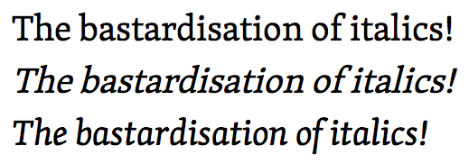
In short, all hell breaks loose. Font-rendering engines create weight and style variations by stretching and resizing existing fonts. In web typography, this is probably the biggest sin of them all: letting your rendering-engine decide how to handle your kerning, weight sizing, or letting it render all of your letters at a 15 degree angle and call them italic.

bastardisation of italics

In the above image, you can see the original file, followed by a faux-italic version of the font, rendered by the system, followed by the tyopgrapher's intended italic styling. See a similar comparison in the following image:

font examples

Multiple source files can be defined in an @font-face declaration, and the last supported file type listed will be rendered by the user's browser. So, basically you're listing fonts in order from worst to best, and the browser will pick the best filetype it can work with. WOFF is supported by all current browsers, as of 2014. However, if you're ensuring compatibility with IE8 or Android 4.3 (Jelly Bean), you will want to first include an EOT file for IE, then a TTF or OTF font for Android 2+.

An interesting note is that you may want to purposefully force mobile users to fallback to system fonts when they are available, especially for body type, to save bandwidth and increase page rendering time.

For example, on older, underpowered Android devices, you can call 'Droid Sans' in your font-family declaration, after calling your webfonts but before calling your fallback Macintosh and Windows system fonts. Then, if your browser fails to load the WOFF or EOT file, it will check for the Android-specific system font before falling back to other system fonts. This way, you can reduce both page load and render time for large blocks of body text.

A careful understanding of how your fallback fonts cascade in different browsers can give you an enormous amount of control over the typography on your page.

cover: https://31.media.tumblr.com/ba7758a52675589e05dc931572be9688/tumblrn7ygur3NV91st5lhmo11280.jpg
category: CSS
subcategory: Web Fonts

//www.gravatar.com/avatar/9217f68fb557d906a5b7c625bc8bf7dd?d=404
Web Developer
kidgodzilla.com

Thanks for reading this post! Follow our blog for instant updates. facebook: dgamr twitter: dgamr gplus: 112387059563392387400 pinterest: dgamr github: KidGodzilla

Tagged:

Anatomy of an @font-face Declaration


Posted by James Futhey on Tuesday, July 22, 2014

First Things First: The @font-face declaration (basic syntax) Before we can call a font that doesn't exist on the local machine, we have to use @font-face to load it off the interwebs. @font-face { font-family: 'Open Sans'; font-style: normal; font-weight: 300; src: local('Open Sans Light'), local('OpenSans-Light'), url(https://themes

First Things First: The @font-face declaration (basic syntax)

Before we can call a font that doesn't exist on the local machine, we have to use @font-face to load it off the interwebs.

@font-face {
    font-family: 'Open Sans';
    font-style: normal;
    font-weight: 300;
    src: local('Open Sans Light'), local('OpenSans-Light'), url(https://themes.googleusercontent.com/static/fonts/opensans/v8/DXI1ORHCpsQm3Vp6mXoaTXhCUOGz7vYGh680lGh-uXM.woff) format('woff');
}

You'll notice that several css properties are declared before the src: file is loaded. This is so that we can optionally load separate font files for multiple font weights and styles. Although the WOFF format can contain multiple weights and styles, the file we are using may not.

So, What happens when we call a web font?

When we call a remote web font, our browser searches for an EXACT MATCH among our @font-face declarations, including weight, face, and style, for EACH INDIVIDUAL GLYPH or language family / character encoding.

This is important to remember when working with other languages (Especially Asian languages). For example, if you are working with Chinese or Japanese, there are only a few fonts in existence, and invariably, they all have terrible Roman lettering for English text. Most contain a wide monospaced font. So, generally, you'll want to declare your English-language webfonts before declaring a set of Windows and Macintosh system fonts.

So, What happens when we match a font face but not a specific style or weight?

In short, all hell breaks loose. Font-rendering engines create weight and style variations by stretching and resizing existing fonts. In web typography, this is probably the biggest sin of them all: letting your rendering-engine decide how to handle your kerning, weight sizing, or letting it render all of your letters at a 15 degree angle and call them italic.

In the above image, you can see the original file, followed by a faux-italic version of the font, rendered by the system, followed by the tyopgrapher's intended italic styling. See a similar comparison in the following image:

Multiple source files can be defined in an @font-face declaration, and the last supported file type listed will be rendered by the user's browser. So, basically you're listing fonts in order from worst to best, and the browser will pick the best filetype it can work with. WOFF is supported by all current browsers, as of 2014. However, if you're ensuring compatibility with IE8 or Android 4.3 (Jelly Bean), you will want to first include an EOT file for IE, then a TTF or OTF font for Android 2+.

An interesting note is that you may want to purposefully force mobile users to fallback to system fonts when they are available, especially for body type, to save bandwidth and increase page rendering time.

For example, on older, underpowered Android devices, you can call 'Droid Sans' in your font-family declaration, after calling your webfonts but before calling your fallback Macintosh and Windows system fonts. Then, if your browser fails to load the WOFF or EOT file, it will check for the Android-specific system font before falling back to other system fonts. This way, you can reduce both page load and render time for large blocks of body text.

A careful understanding of how your fallback fonts cascade in different browsers can give you an enormous amount of control over the typography on your page.

cover: https://31.media.tumblr.com/e7ac48834604ac8e9aaf4a3c106c4e86/tumblrn9hxd1c4Y81st5lhmo11280.jpg
category: CSS
subcategory: Web Fonts

//www.gravatar.com/avatar/9217f68fb557d906a5b7c625bc8bf7dd?d=404
Web Developer
kidgodzilla.com

Thanks for reading this post! Follow our blog for instant updates. facebook: dgamr twitter: dgamr gplus: 112387059563392387400 pinterest: dgamr github: KidGodzilla

Tagged: Faux-Italics, @font-face, Multiple Language Supprt, Mobile, CSS, Fonts, Web Fonts

Welcome to Ghost


Posted by James Futhey on Thursday, July 17, 2014

You're live! Nice. We've put together a little post to introduce you to the Ghost editor and get you started. You can manage your content by signing in to the admin area at <your blog URL>/ghost/. When you arrive, you can select this post from a list

You're live! Nice. We've put together a little post to introduce you to the Ghost editor and get you started. You can manage your content by signing in to the admin area at <your blog URL>/ghost/. When you arrive, you can select this post from a list on the left and see a preview of it on the right. Click the little pencil icon at the top of the preview to edit this post and read the next section!

Getting Started

Ghost uses something called Markdown for writing. Essentially, it's a shorthand way to manage your post formatting as you write!

Writing in Markdown is really easy. In the left hand panel of Ghost, you simply write as you normally would. Where appropriate, you can use shortcuts to style your content. For example, a list:

  • Item number one
  • Item number two
    • A nested item
  • A final item

or with numbers!

  1. Remember to buy some milk
  2. Drink the milk
  3. Tweet that I remembered to buy the milk, and drank it

Want to link to a source? No problem. If you paste in url, like https://ghost.org - it'll automatically be linked up.

Want to link to a source? No problem. If you paste in url, like https://ghost.org - it'll automatically be linked up. But if you want to customise your anchor text, you can do that too! Here's a link to the Ghost website. Neat.

What about Images?

Images work too! Already know the URL of the image you want to include in your article? Simply paste it in like this to make it show up:

The Ghost Logo

Not sure which image you want to use yet? That's ok too. Leave yourself a descriptive placeholder and keep writing. Come back later and drag and drop the image in to upload:

Quoting

Sometimes a link isn't enough, you want to quote someone on what they've said. It was probably very wisdomous. Is wisdomous a word? Find out in a future release when we introduce spellcheck! For now - it's definitely a word.

Wisdomous - it's definitely a word.

Working with Code

Got a streak of geek? We've got you covered there, too. You can write inline <code> blocks really easily with back ticks. Want to show off something more comprehensive? 4 spaces of indentation gets you there.

.awesome-thing {
    display: block;
    width: 100%;
}

Ready for a Break?

Throw 3 or more dashes down on any new line and you've got yourself a fancy new divider. Aw yeah.


Advanced Usage

There's one fantastic secret about Markdown. If you want, you can write plain old HTML and it'll still work! Very flexible.

That should be enough to get you started. Have fun - and let us know what you think :)
subtitle: This is the default post
category: General
subcategory: Default

//www.gravatar.com/avatar/9217f68fb557d906a5b7c625bc8bf7dd?d=404
Web Developer
kidgodzilla.com

Thanks for reading this post! Follow our blog for instant updates. facebook: dgamr twitter: dgamr gplus: 112387059563392387400 pinterest: dgamr github: KidGodzilla

Tagged: Getting Started

Samantha Theme
https://samantha.themespectre.com
Just a blogging platform. shortname: kidgodzilla